timeline: one week
role: designer, developer
publication: North by Northwestern
skills: web development, web design, HTML/CSS/JS
the project
The goal: to build a hub of midterm voting information for college students, from local voting information to absentee voting info by state.
This project was a collaboration between the interactives section and the news & politics section of the magazine; my co-editor tackled the local voting section of the story, while my task was to organize the state voting info into something useful to students.
the process
I began by making a few sketches of what each state “card” could look like. I made a list of everything that needed to be included and grouped related pieces of information – for example, a state’s vote-by-mail requirements and the vote-by-mail deadline.
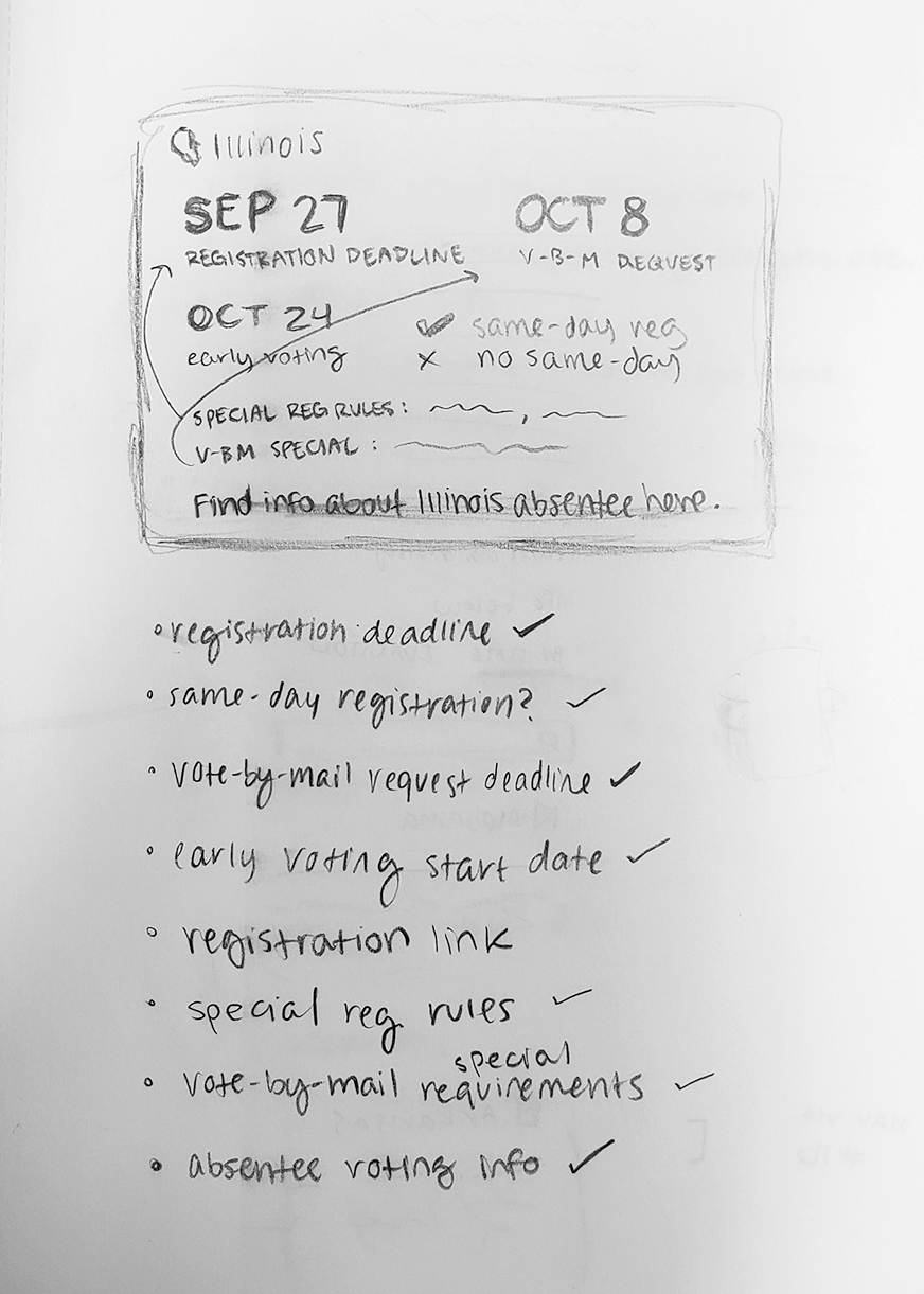
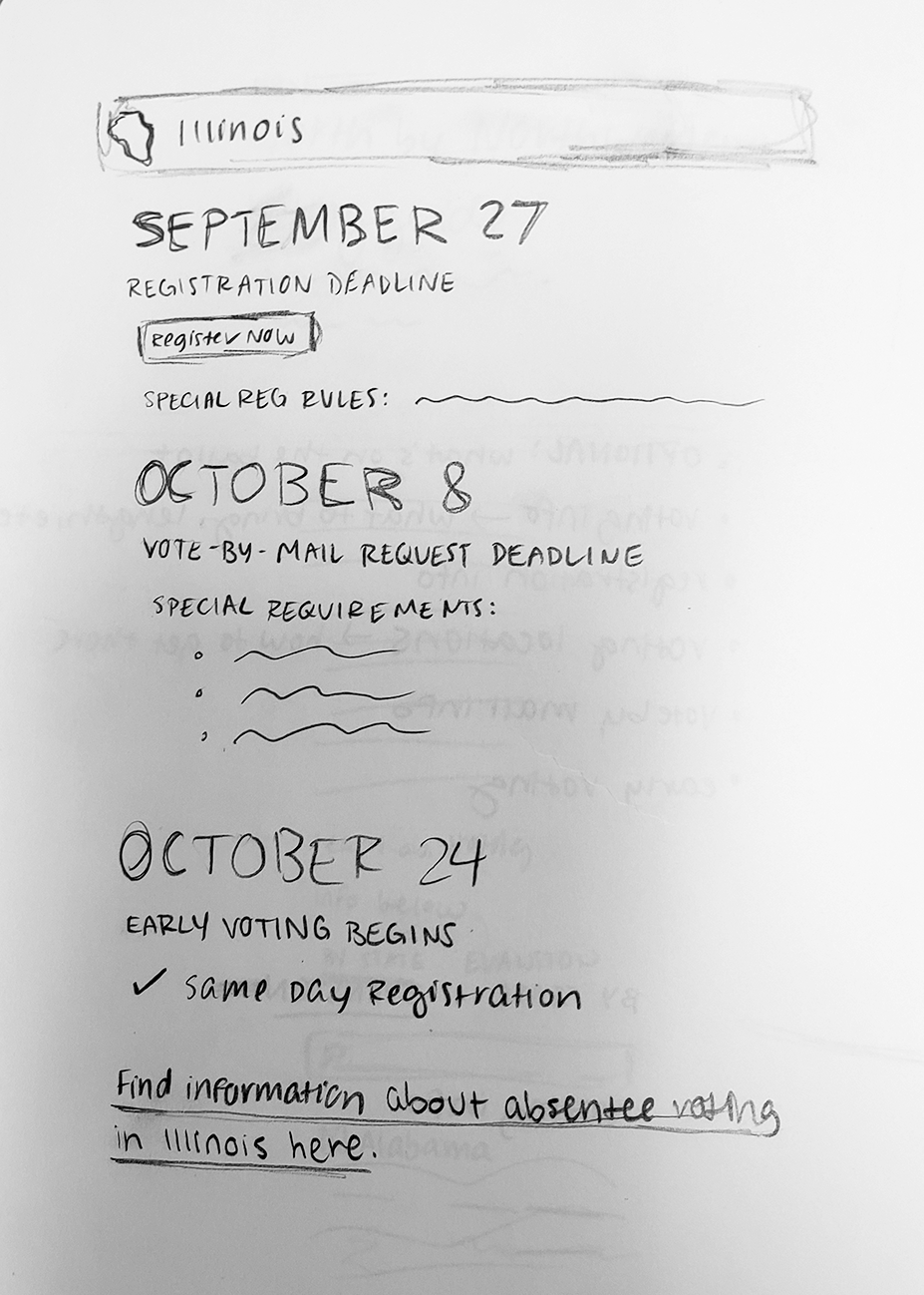
I also had to consider which information to prioritize in the card, so a student could find the information most relevant to them at a glance. I thought the registration deadline was the most important, since you can’t vote at all if you miss that deadline. And since so many college students vote in their home state via absentee ballots, I prioritized voting-by-mail information next.
And for the page to be easily navigable (info about 50 states adds up fast!), I wanted students to be able to search for their state at the top of the page. I wasn’t sure if all of the states should be displayed on the screen at once, but I ultimately decided to keep them all available as the user scrolls down the page – I thought it was interesting to be able to scroll through the states to see where registration was still open, compare deadlines and notice patterns.
the solution
My co-editor and I combined our sections into a comprehensive voting guide – check it out here! Given the fast turnaround needed for this story (we didn’t have all the information needed for the story until a few days before our publish date), I’m pretty happy with how it turned out.
If I had more time to work on it, though, I definitely would have found it helpful to do some user testing – especially on how students would use the state information page. If students only had an interest in finding their own state information, I’d hide each card until it’s searched for a simpler design. I would also spend more time on the filtering search bar at the top of the page to make it easier for users with screenreaders to access. Overall, though, this was a fun project to take on and I learned a lot about developing service journalism pieces.